monoprix champs-Elysées
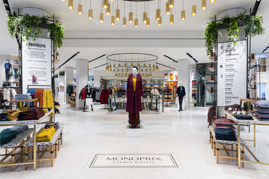
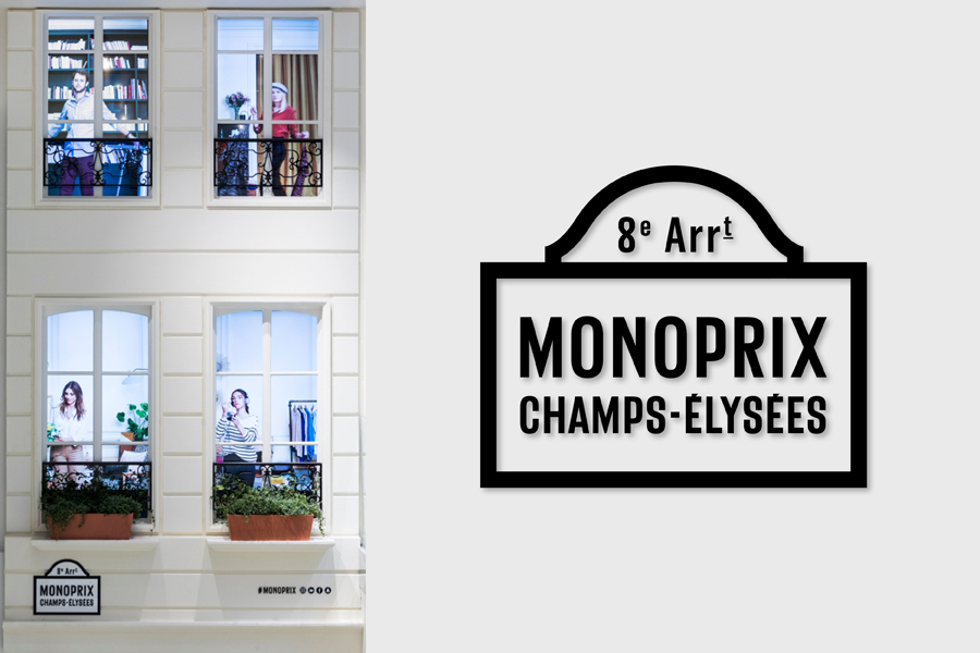
Monoprix recently reopened the doors of its flagship store on the Champs Elysees with a bold and stylish ode to the Parisian lifestyle.
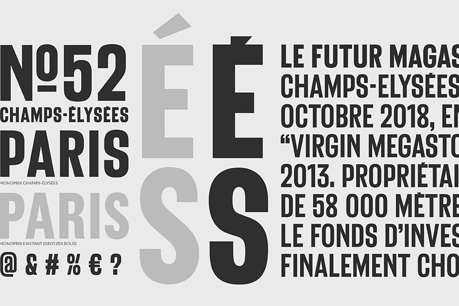
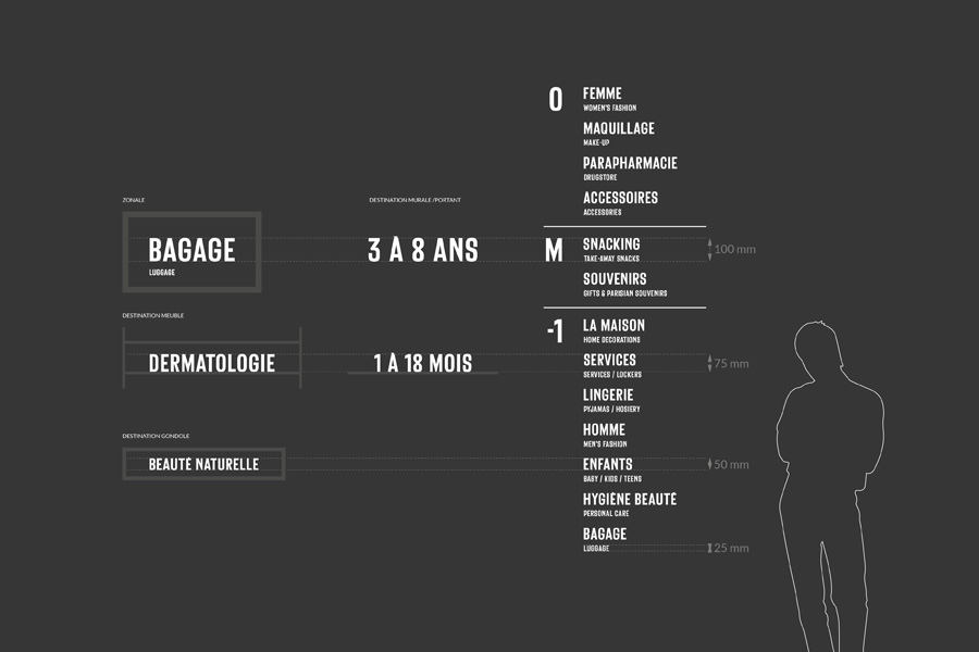
WIPbrands accompanied the French brand in this transformation by crafting unique, Paris-inspired signage, built around a fresh, original font designed especially for the occasion.
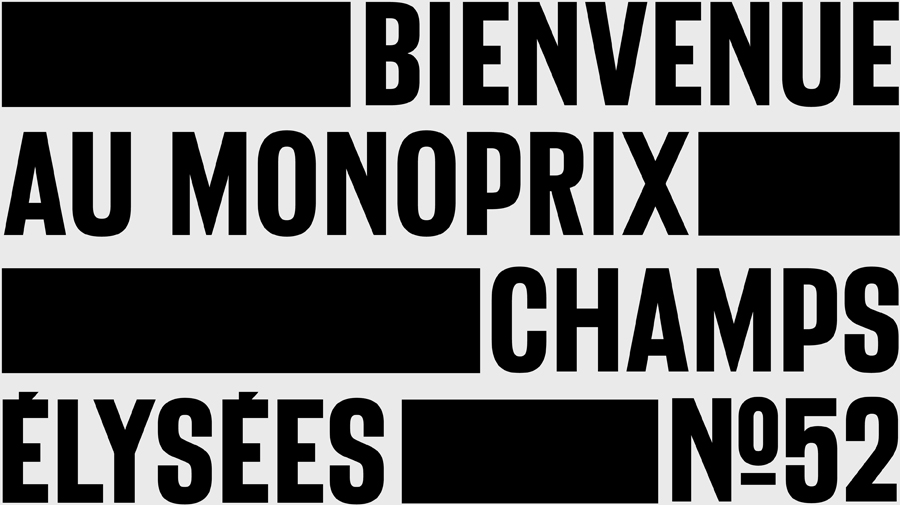
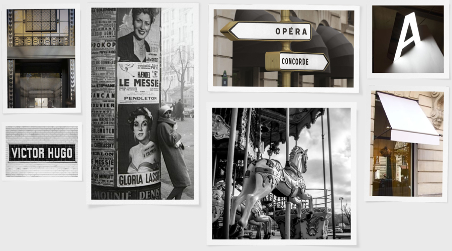
The typeface, baptized “Champs Elysees”, was developed in partnership with the typographer, Marc Rouault, exclusively for Monoprix.
The new typeface is a reinterpretation of the iconic typography that can be found on all of the brand’s packaging with the famous colored bands. The typeface was revisited to recall “antique” typographies by Deberny & Peignot from the 20s and 30s, all while paying tribute to the historic tiles that still adorn certain stations of the Parisian metro.
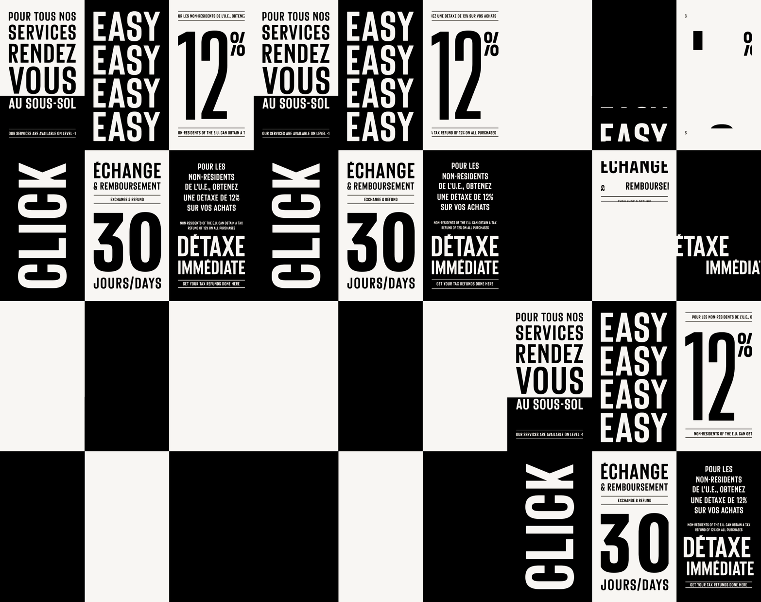
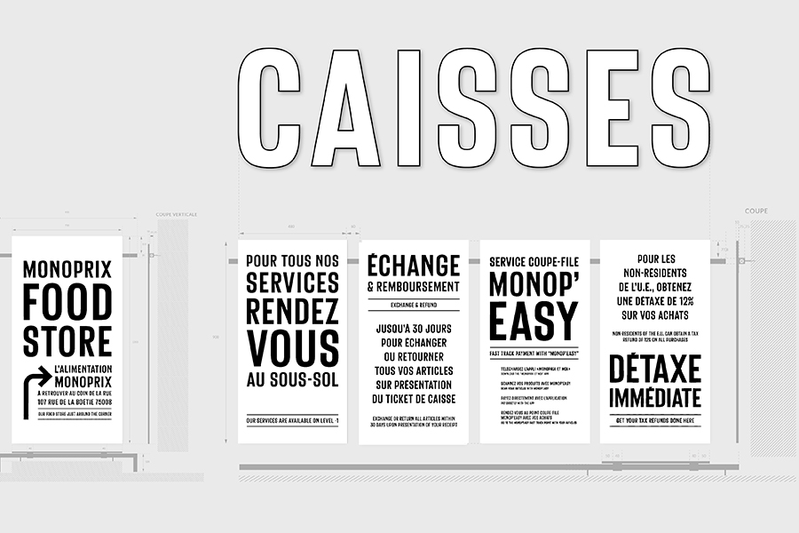
The new typeface is strongly anchored in all signage and is particularly emphasized in strategic areas of the store as “flagship” signs inspired by the symbolic architectural codes of the city of Paris.
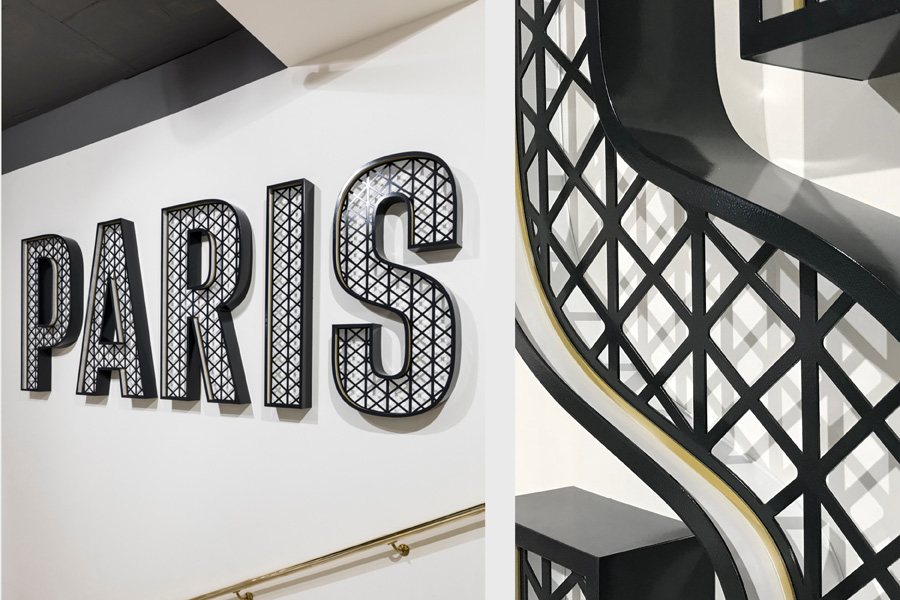 Paris flagship sign — inspired by the architecture of the Eiffel Tower and the love locks on the Pont des Arts pedestrian bridge.
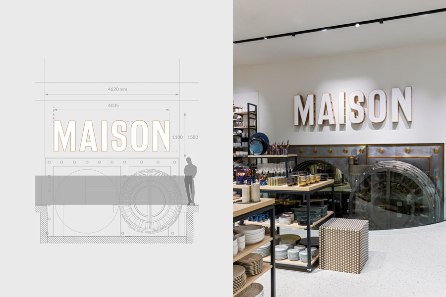
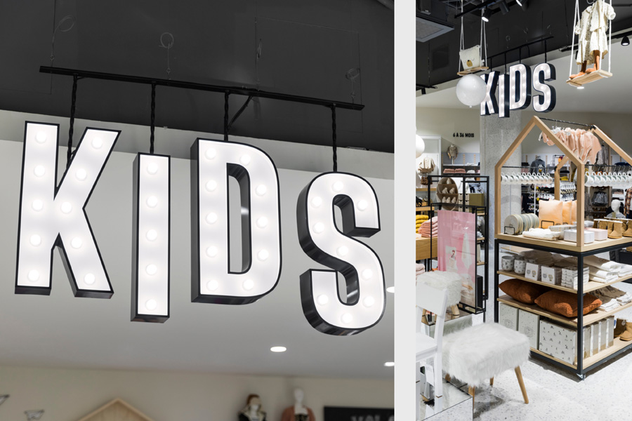 KIDS flagship sign — inspired by the Montmartre carrousel
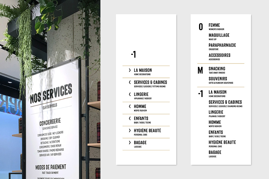
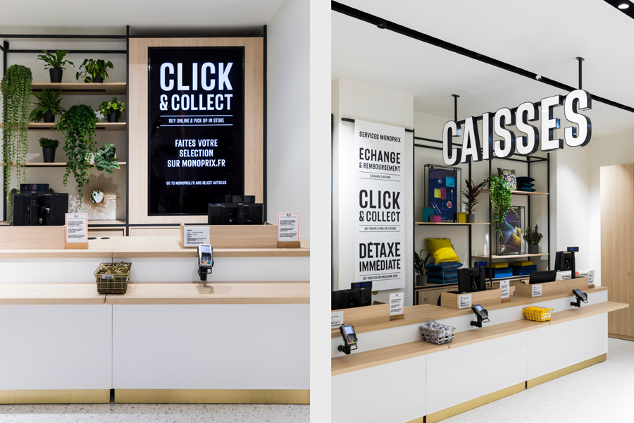
A typographic “bayadère” system was created to echo the colored bands of the brand. The different services offered by Monoprix Champs Elysees are promoted in the form of front-page newspaper headlines displayed on the Morris columns.
Photos credits: Romain Ricard
Signage manufacturers: DT sign / Gutenberg / Shop Concept
