Kempinski identity evolution
We have developed a refreshed brand identity for Kempinski, the luxury hospitality group. The new visual identity celebrates Kempinski’s heritage as pioneers of luxury hospitality in Europe with a contemporary look and feel.
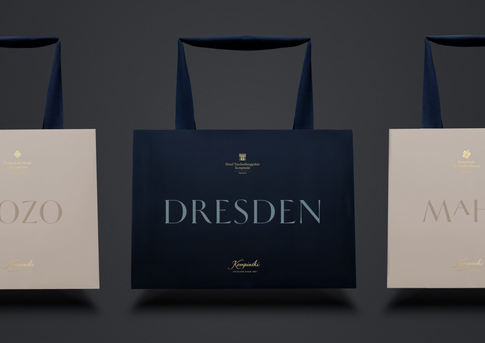
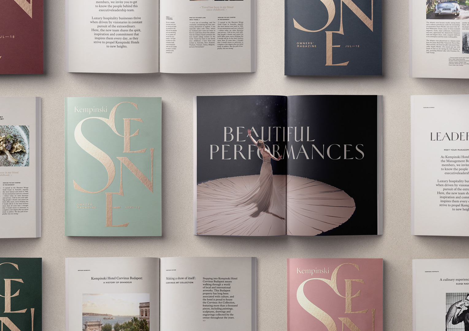
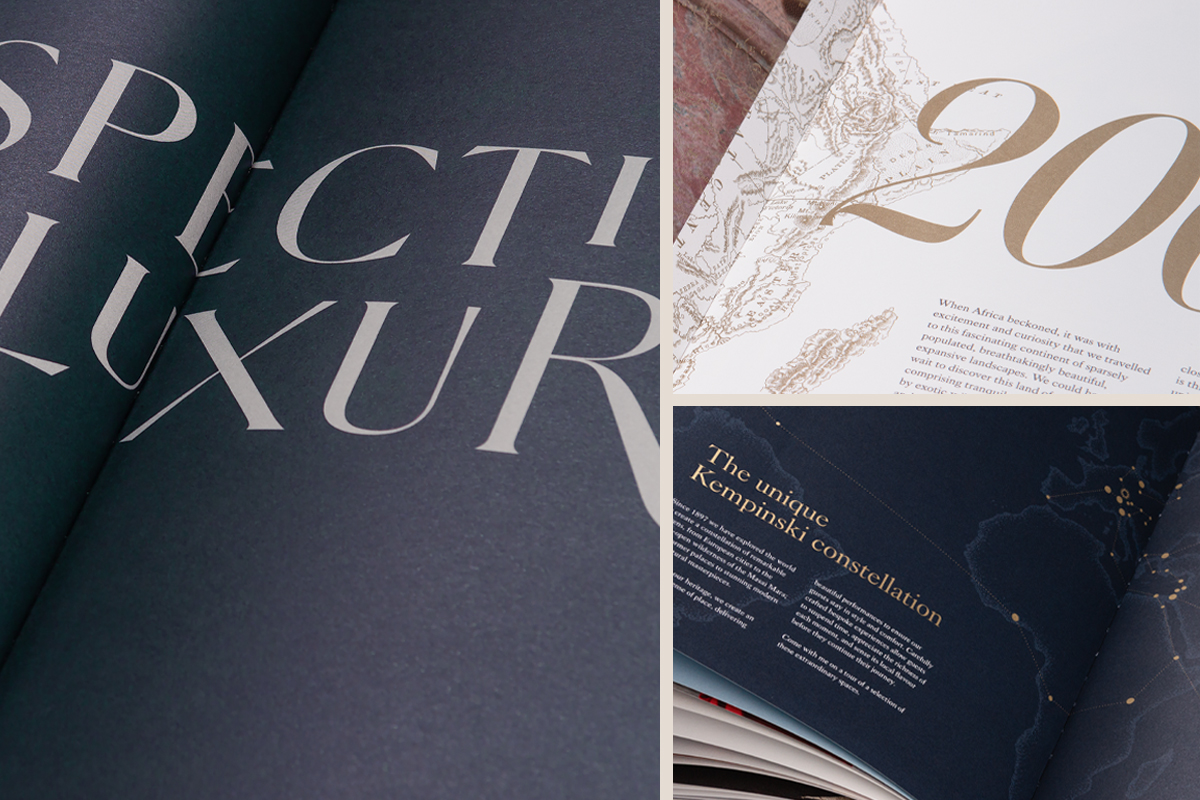
It features a bespoke typeface, an ownable colour palette and a rich illustration style to express the sense of craftsmanship and timeless elegance that characterises Kempinski’s luxury experience.
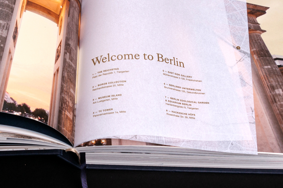
The identity is consistent, but also adaptable, with a unified visual language that works across the different destinations and regions where Kempinski operates.
![]()
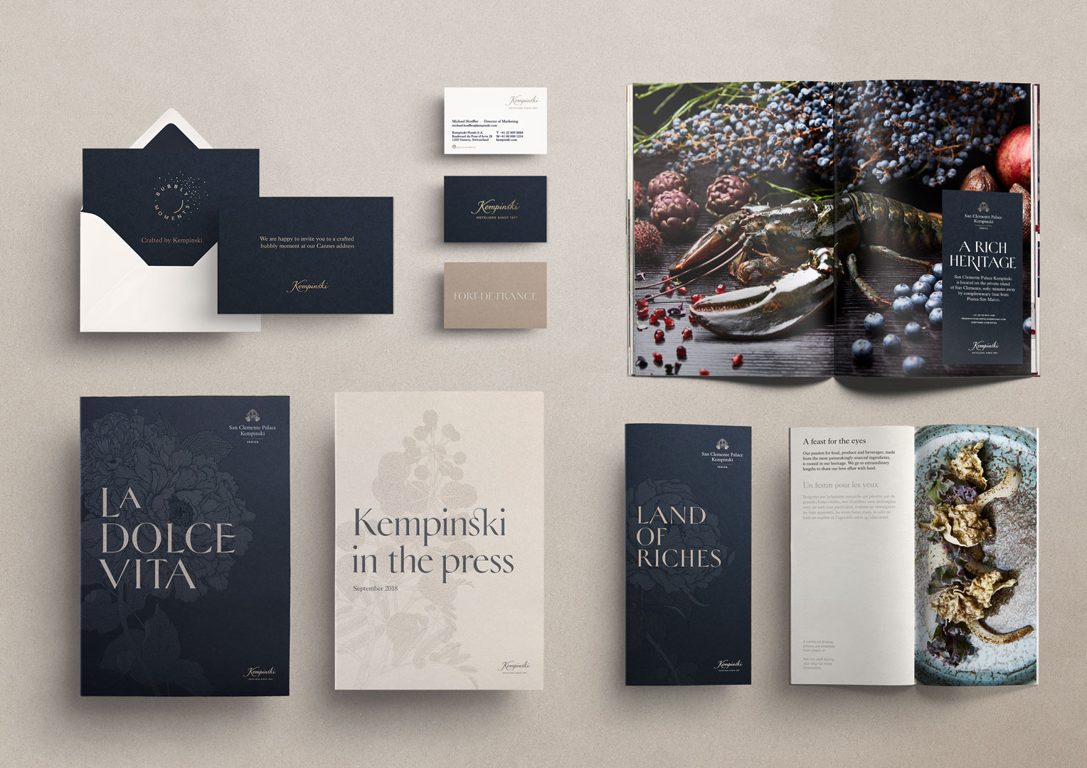
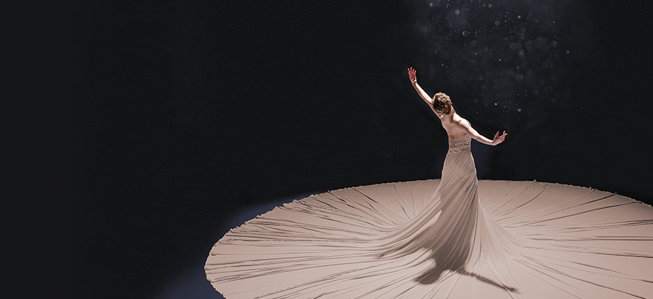
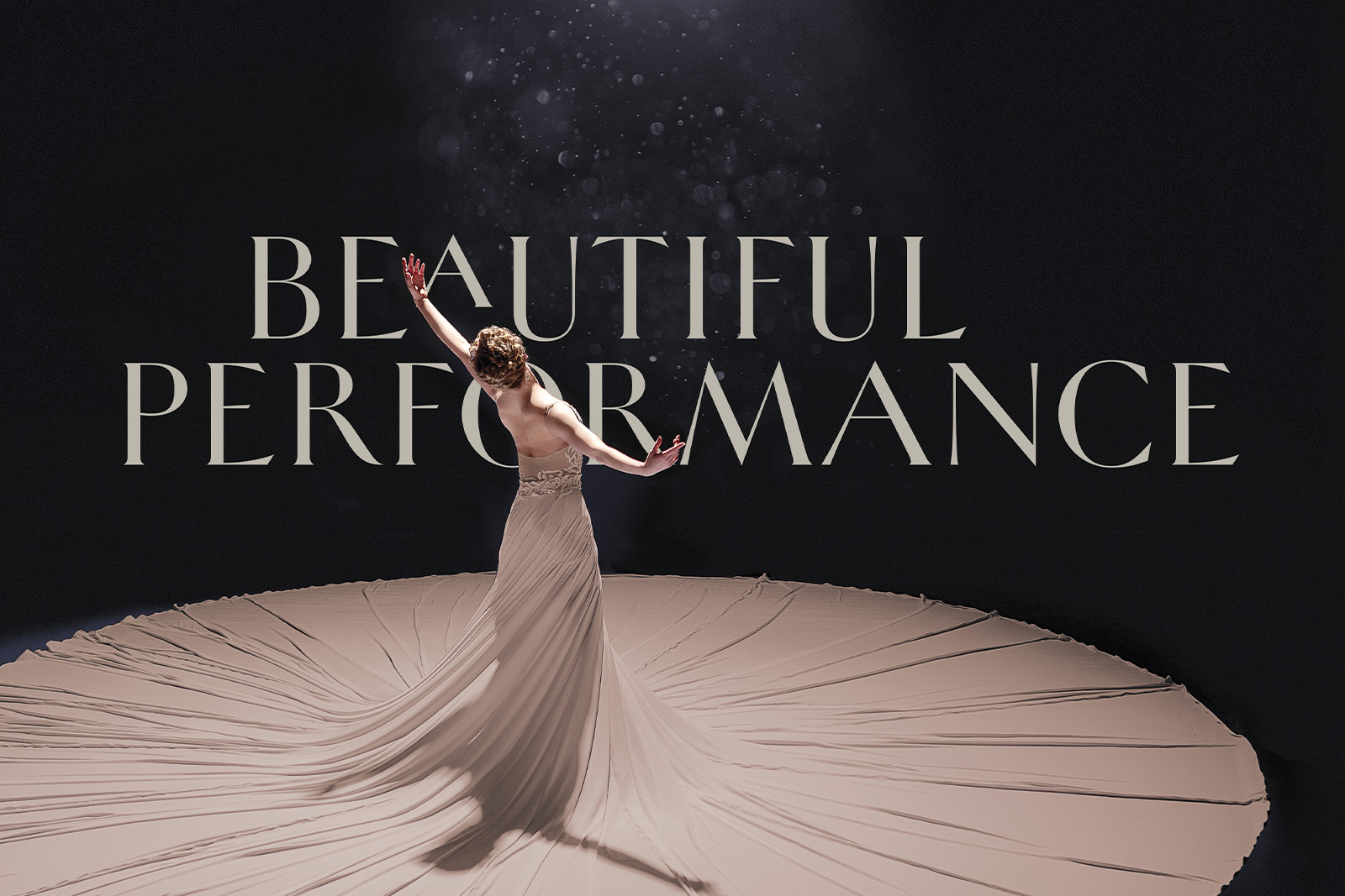
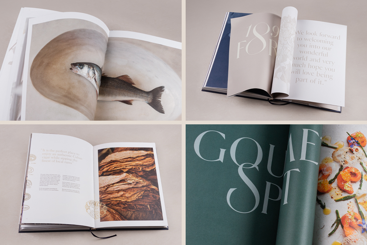
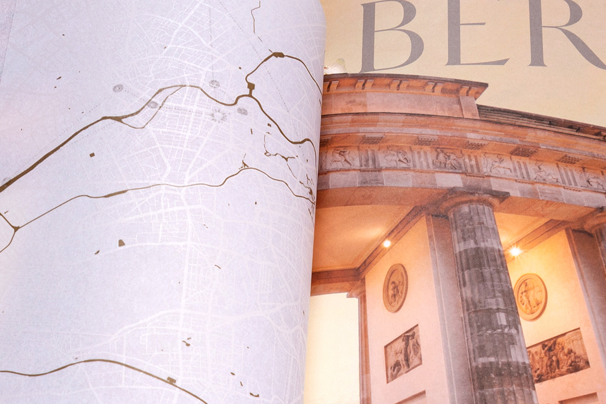
The visual style also includes a new approach to photography with rich and textured imagery that elicits emotion and elevates the everyday elements of the hotel experience into a piece of art. For gastronomy, WIPbrands teamed-up with Danish photographer Claes Bech-Poulsen to set a new standard for still-life photography. The photography of interiors also takes a new direction, with a human-centred approach that puts service at the heart of the experience.
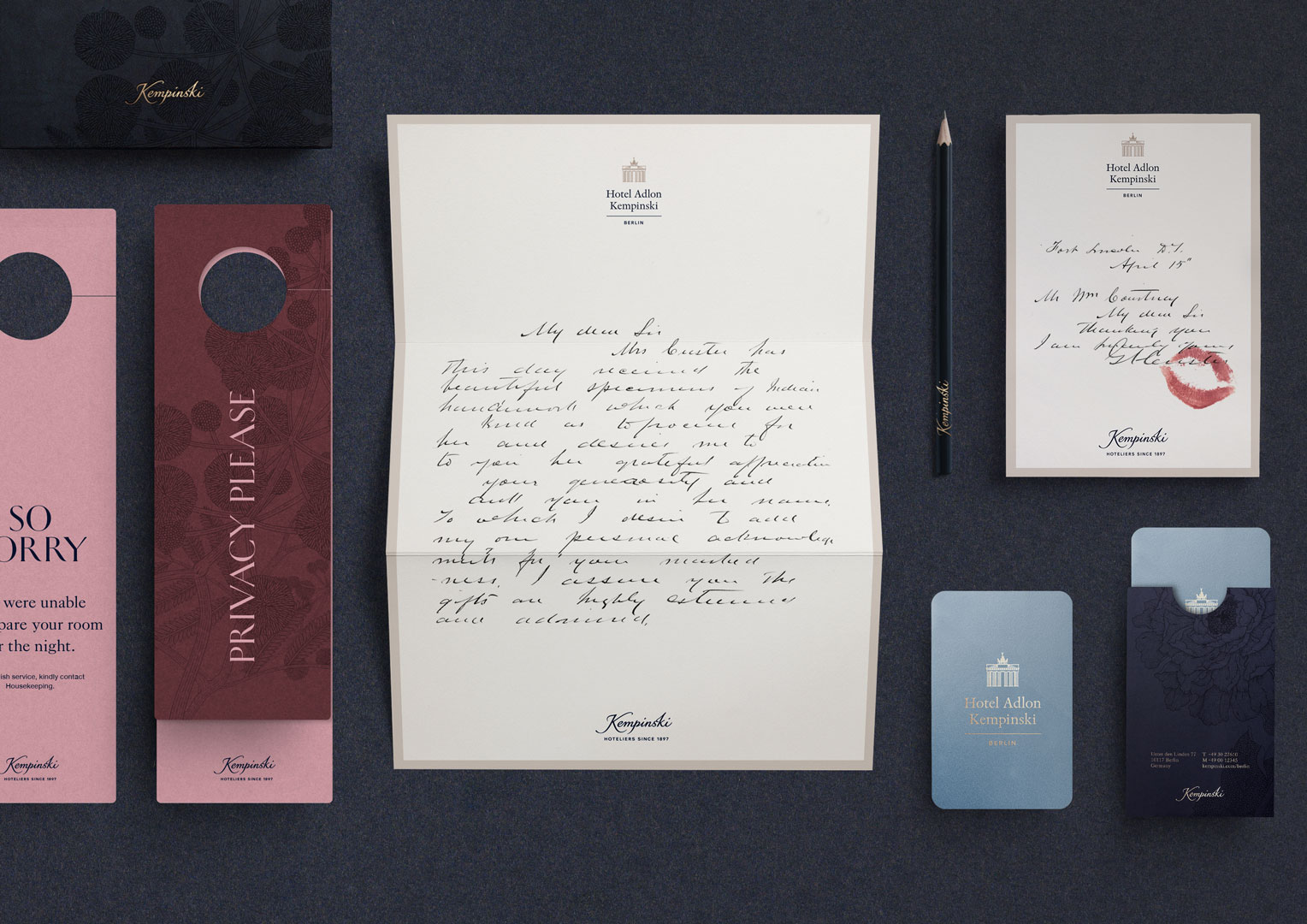
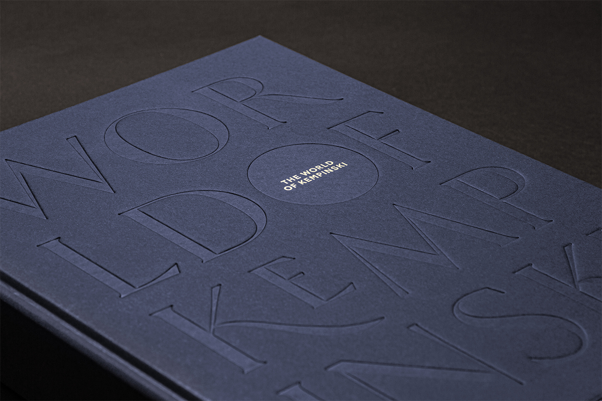
We also worked in close collaboration with French typographer Mathieu Réguer to create a bespoke headline typeface – ‘HeleneHess’, named as a tribute to the wife of Berthold Kempinski. HeleneHess is an extensive latin serif font (with over 350 glyphs) that takes inspiration from the brand European Swiss-German roots. A custom-made sans-serif typeface sits alongside it to improve legibility and bring visual unity to a wide portfolio of sub-brands, products and services.
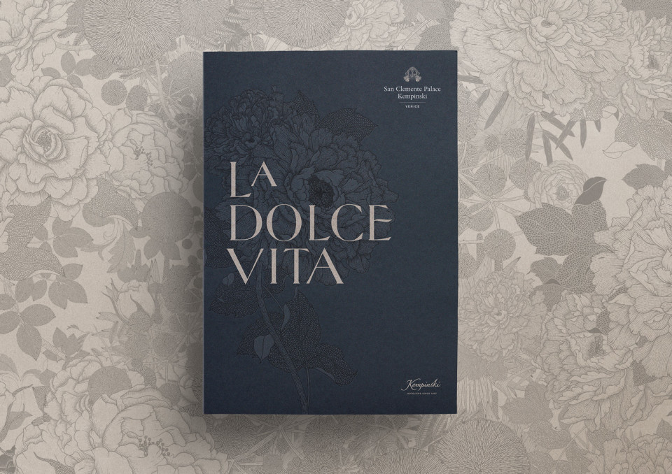
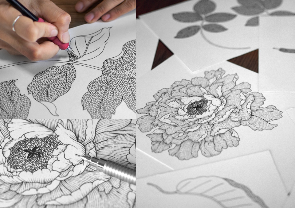
A bespoke set of illustrations, developed in collaboration with Thai illustrator Suthipa Kamyam further enriches the brand language when used as a pattern in printed materials. Entitled ‘Flowers of the World’, the illustrations feature a bouquet of four flowers, each a symbol of the regions where Kempinski operates in.
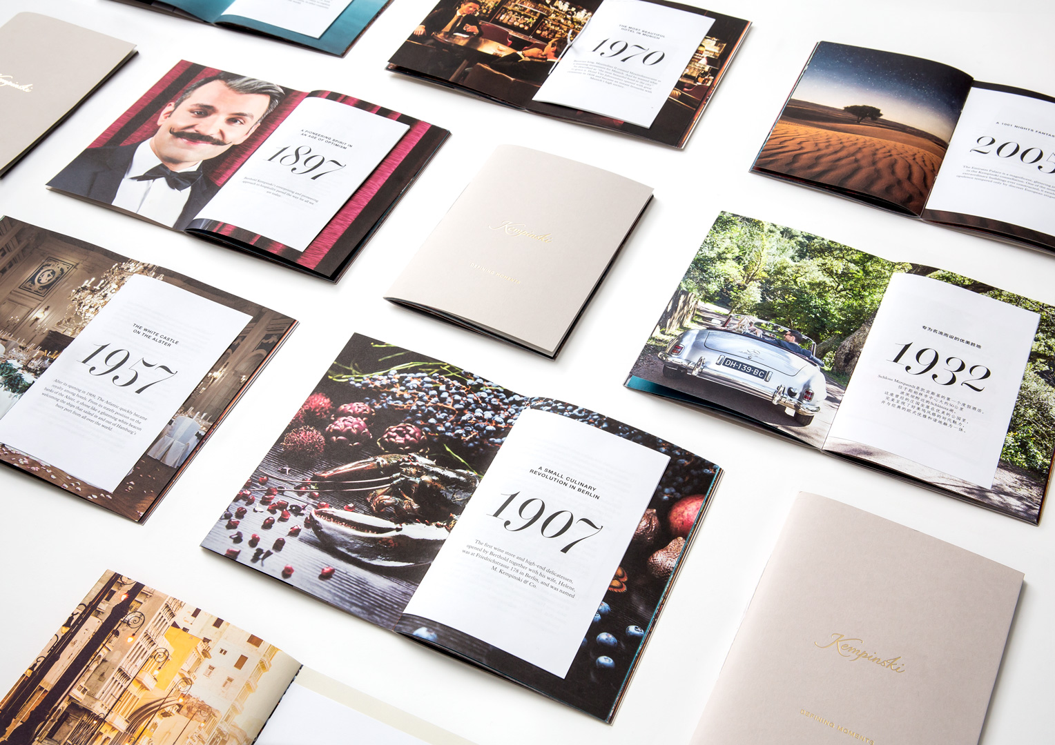
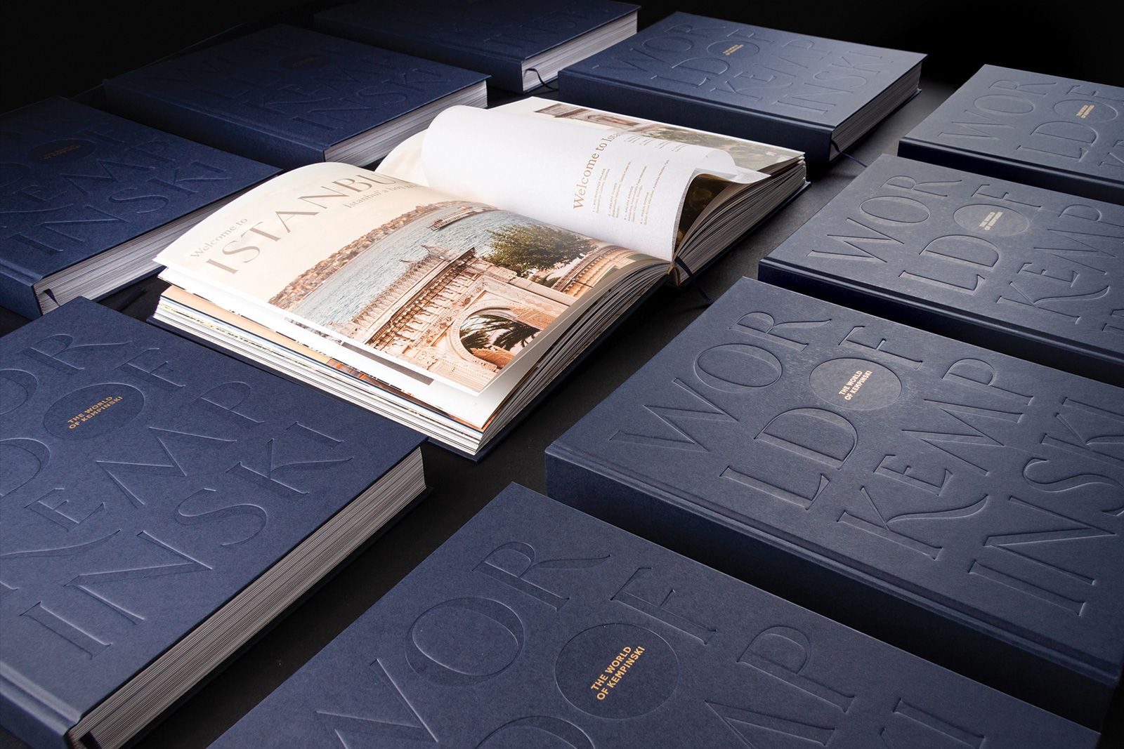
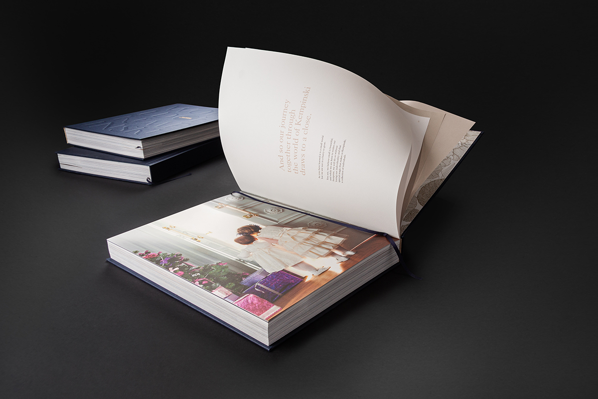
Tp conclude, this printed coffee table book with its crafted typographic debossing and gold foil detail pay homage to Kempinski’s 122 years of hospitality across the globe and constellation of unforgettable properties. Our challenge was to evolve the existing identity into a coherent brand that intuitively transmits the experience of being at Kempinski, wherever you are in the world.
At the other end of the spectrum, photography gave us an opportunity to be bold and capture the originality and slightly eccentric nature of Kempinski. With immersive images that highlight textures and colours, we elicit emotion and appeal to the senses that underpin Kempinski’s luxury experience.
Craft informed our choice of printing materials and finishes, adding texture and warmth across the customer journey, from brochures to stationery, to in-room collateral and printed communications.
We drew inspiration from Kempinski’s wealth of heritage, delving into its priceless archive of Swiss-German design dating back to the nineteenth century. At the very essence of it was Kempinski’s long standing commitment to design and craft. Empowered by those findings, we set out to develop the brand into something that can be seen, but that can also be felt and experienced.
© The images in the book are private property and belong to Kempinski