JARDILAND
Jardiland, the french brand dedicated to gardening and pet care, asked WIPbrands and Intangibles to rethink their global identity and collaborate with them on their brand refresh.

Before / After
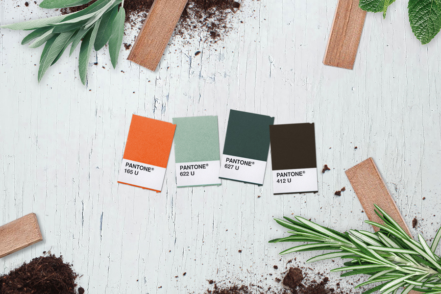
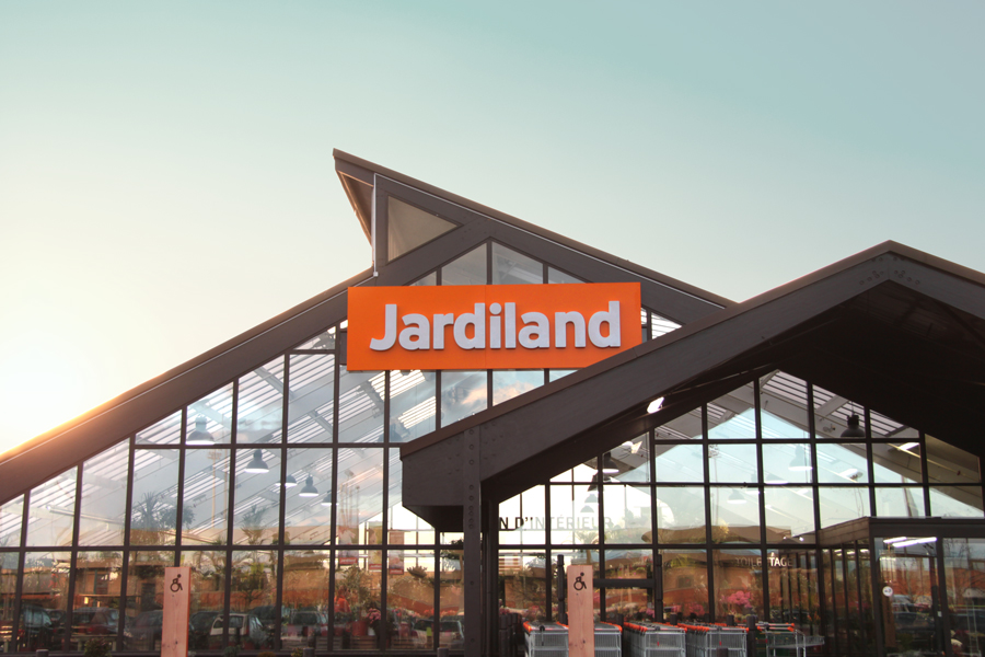
In order to re-establish its position of leader, Jardiland has reconnected with its heritage by choosing orange as its primary brand colour.
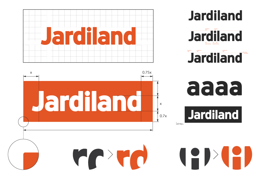
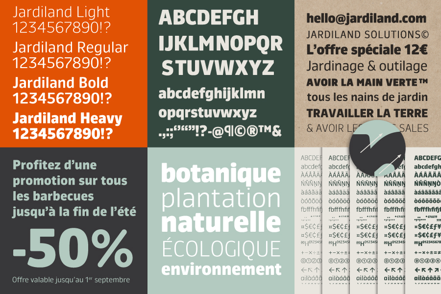
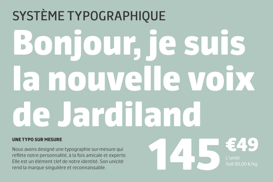
To best represent the different brand values, a bespoke typeface has been created by Mathieu Réguer where the various weights have been designed to reflect, on the one hand the expertise, and on the other, the friendly accessibility of the brand.
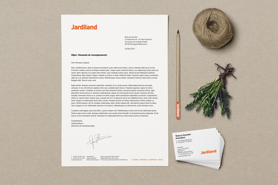
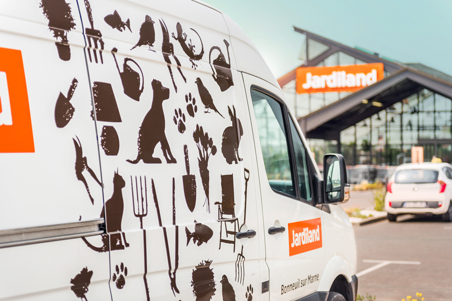
A diverse set of graphic elements, from photographic to graphic silhouettes and technical icons, added to the range of materials and textures used, renders the visual identity rich and vibrant.
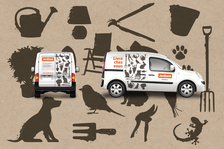
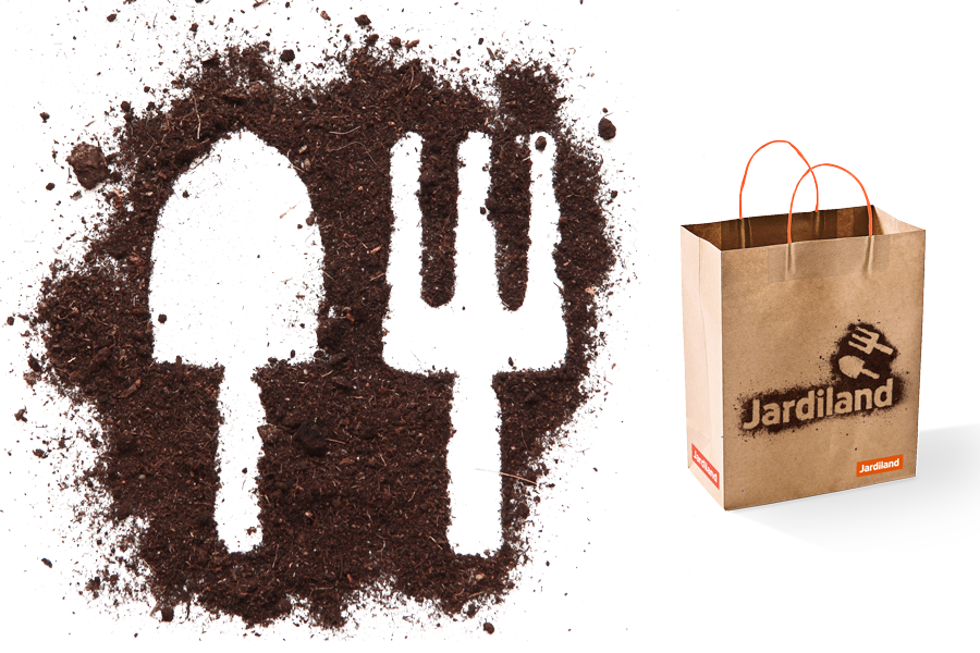
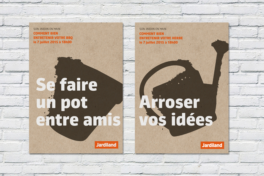
Graphic silhouettes / Used big
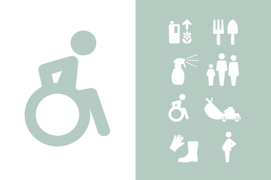
Pictograms / Used small
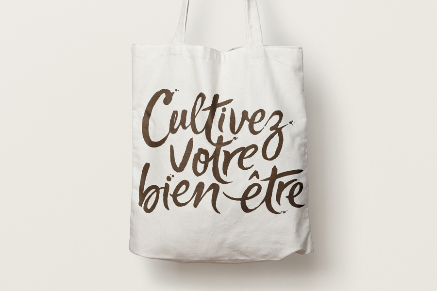
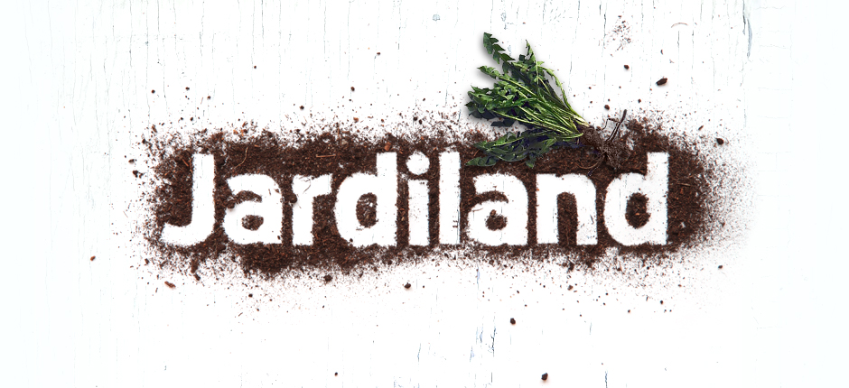
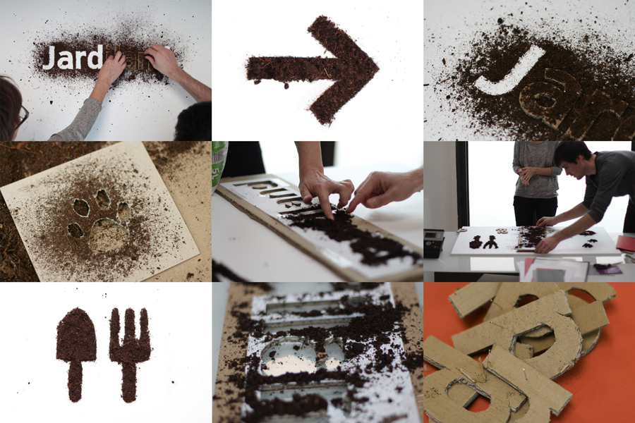
We translated Jardiland’s new values into a vibrant hand-drawn signature.
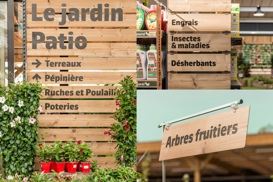
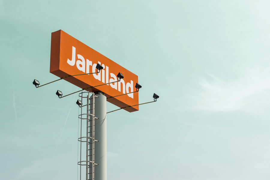
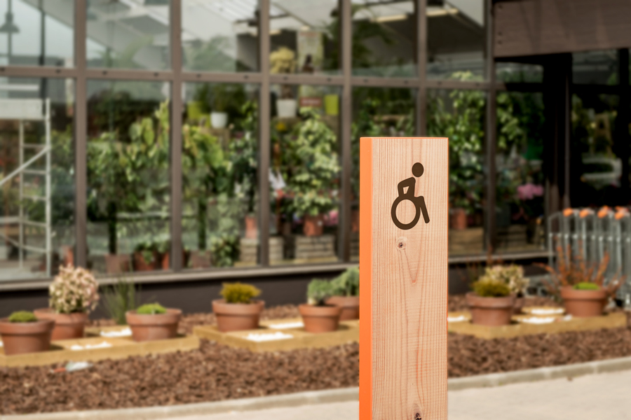
Signage
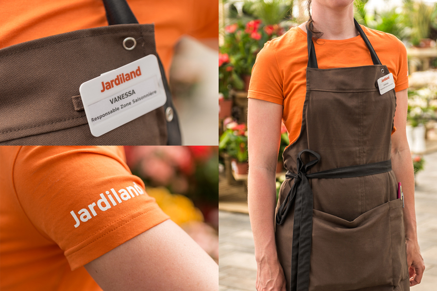
Uniforms
 Advertising campaign directed by La Chose

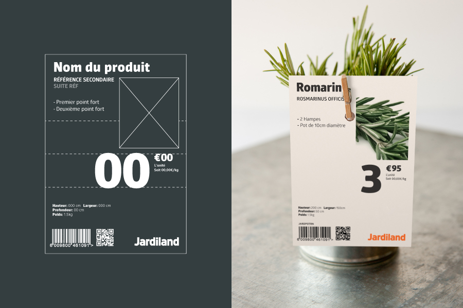
Own brand packaging
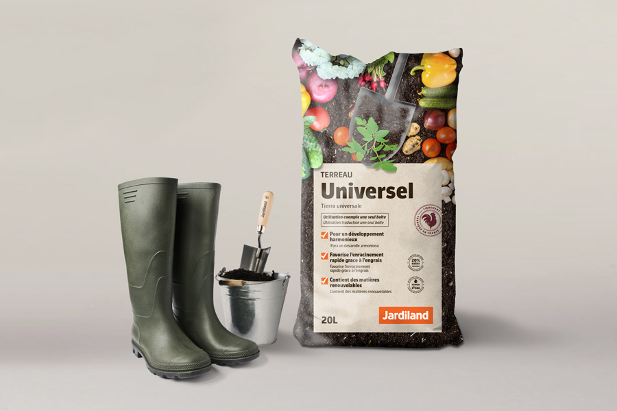
We created over 400 home-brand references for Jardiland throughout all their categories and extended the brand identity.
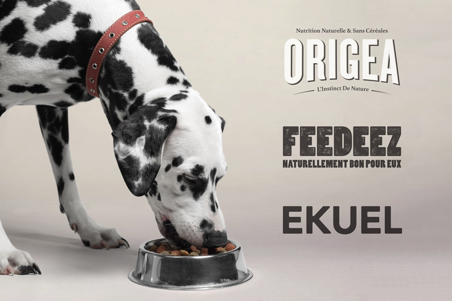
We created 6 successful exclusive brands for Jardiland ranging from pet food to aquariums.
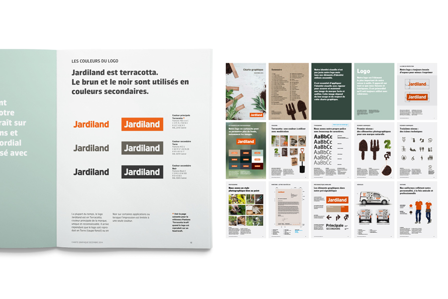
Graphic Guidelines
Architectural concept developed by Intangibles