MARCHON
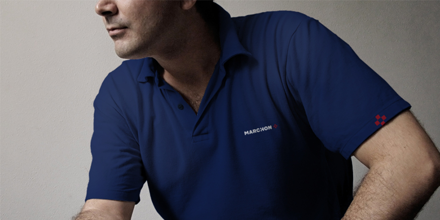
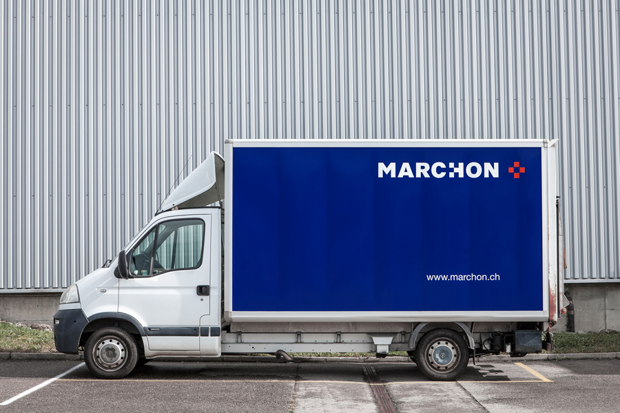
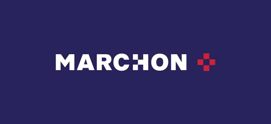
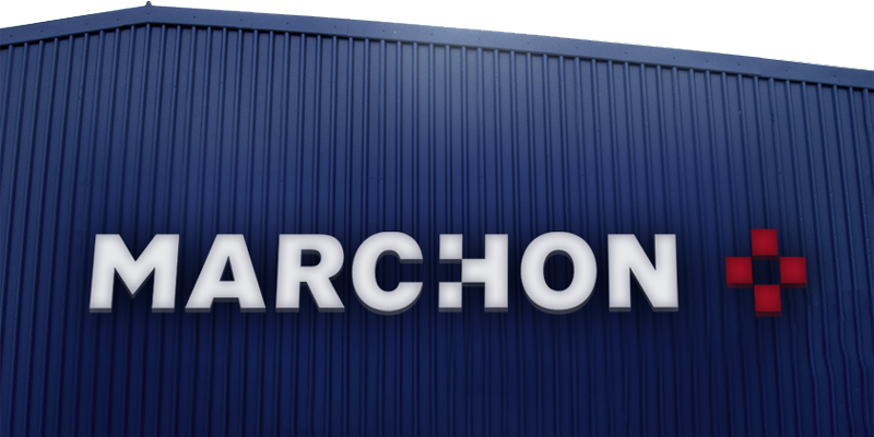
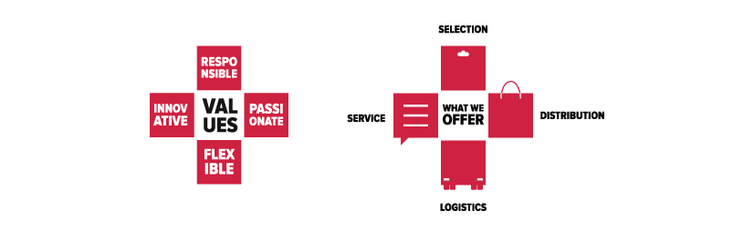
WIP evolved the brand universe for MARCHON, including refreshing their logo and re-looking the graphic system. To ensure a coherent system, WIP organised a creative workshop with the client to help reposition the group, reorganising their values and restructuring their brand hierarchy.
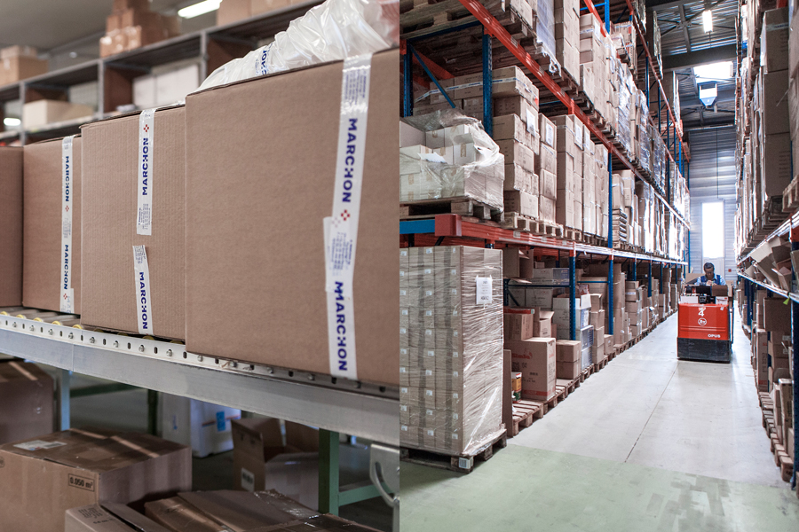
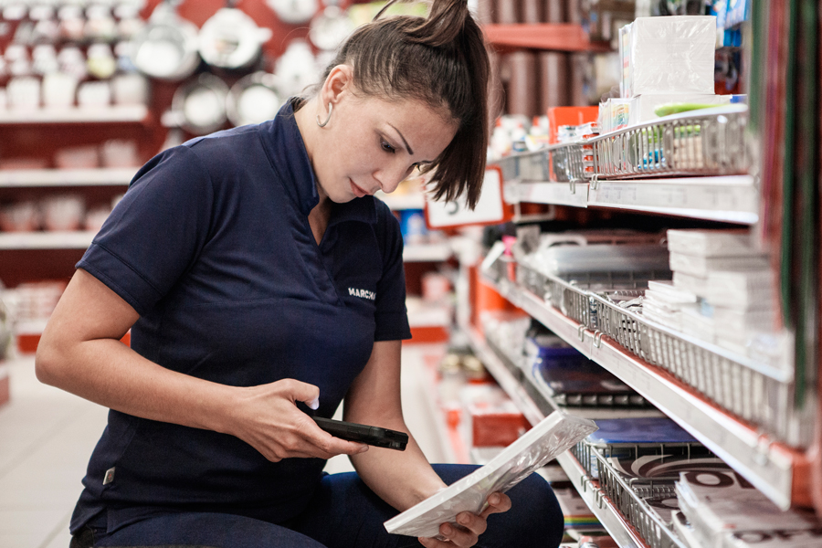
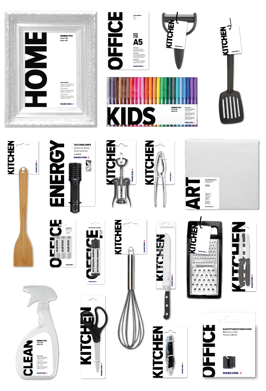
Marchon is a family business founded in 1939 that stock and distribute the essential goods you find around the ’5th isle’ in Swiss supermarkets like Migros, Coop & Manor. Products like flashlights, batteries, kitchen utensils and office supplies.

Avant / Après

Univers graphique
To help distinguish the corporate brand from the B2C brand, we decided to use a dark blue background for corporate applications and white for B2C. A touch of red, as a call to action, reminds us of its Swiss heritage.
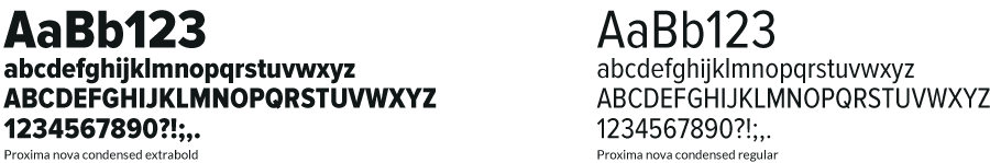

Typographie et couleurs
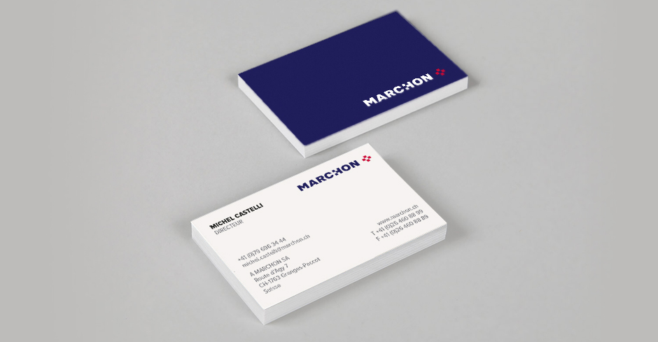
Carte de Visite
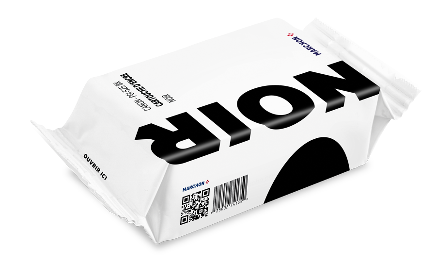
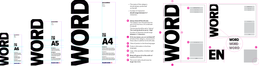
The MARCHON identity needed to evolve from a pure corporate B2B brand to include a client facing side with their own-brand products. To achieve a coherent offer, the packaging needed to be extremely simple as each manufacturer would be responsible for the printing of their own packaging.
Marque de distributeur

Style illustratif